Research translation
Bring dense clinical and research material into language and structures that support real patient questions.
Turning dense, emotionally difficult medical information into an understandable decision-support experience for patients facing fertility-preservation choices during cancer treatment.
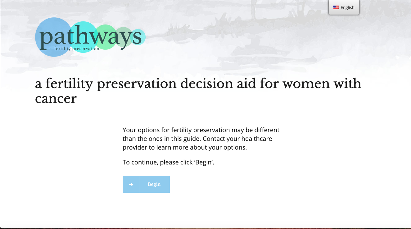
Pathways was developed in conjunction with the Health Services Research team at MD Anderson Cancer Center. Patients were making consequential choices while navigating a serious diagnosis, time pressure, unfamiliar terminology, and questions about future fertility.
The problem was not simply how to put medical information on a website. It was how to organize it so people could understand what mattered, find what they needed, and make progress through a difficult decision.
Information is grouped around the questions a patient is likely to ask—not around the structure of the underlying research or clinical source material.
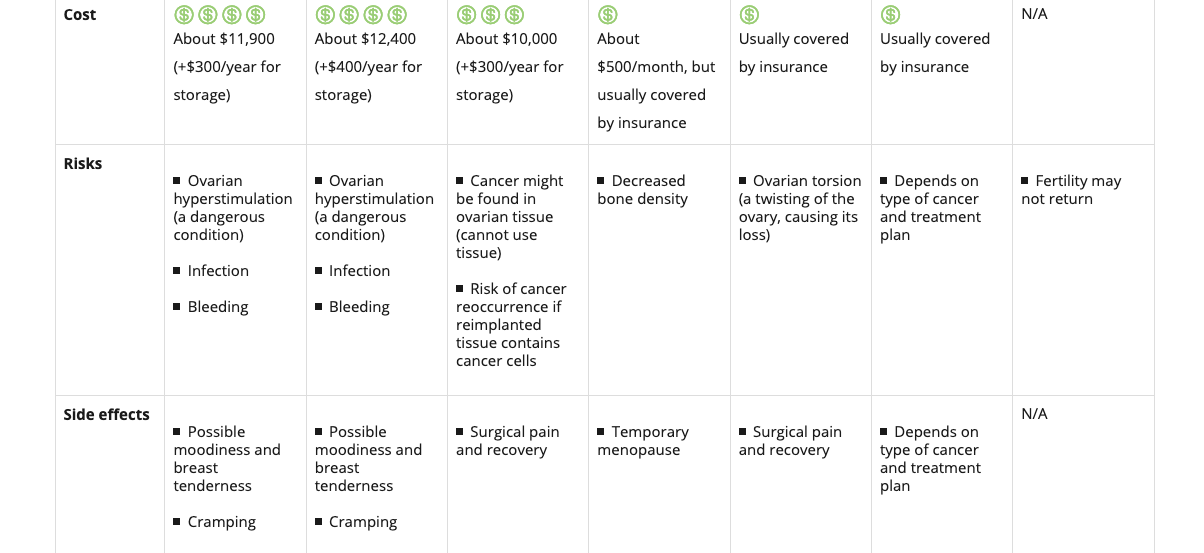
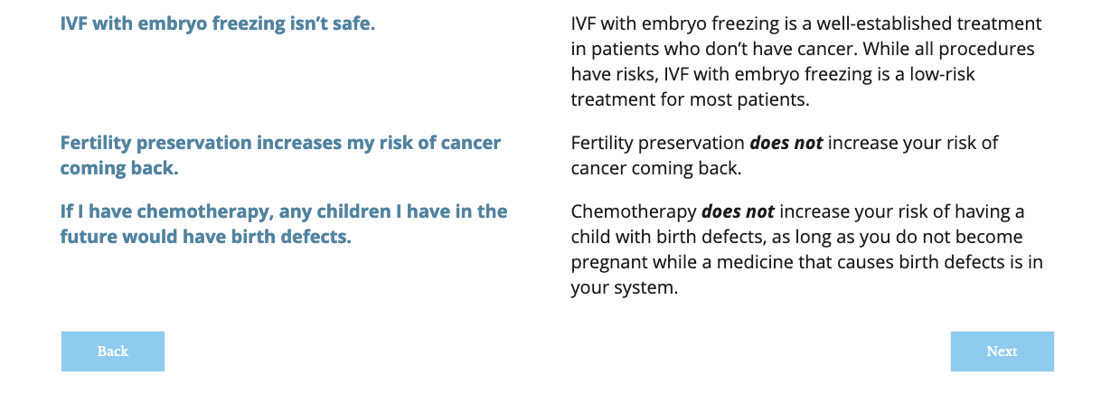
Bring dense clinical and research material into language and structures that support real patient questions.
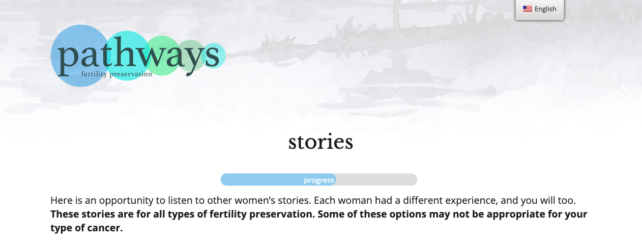
Create a path through the material that gives people orientation without forcing them into a rigid sequence.
Keep the experience calm, legible, and approachable while preserving the seriousness of the subject matter.
Turn the structure and visual system into a working research-facing decision-support experience.
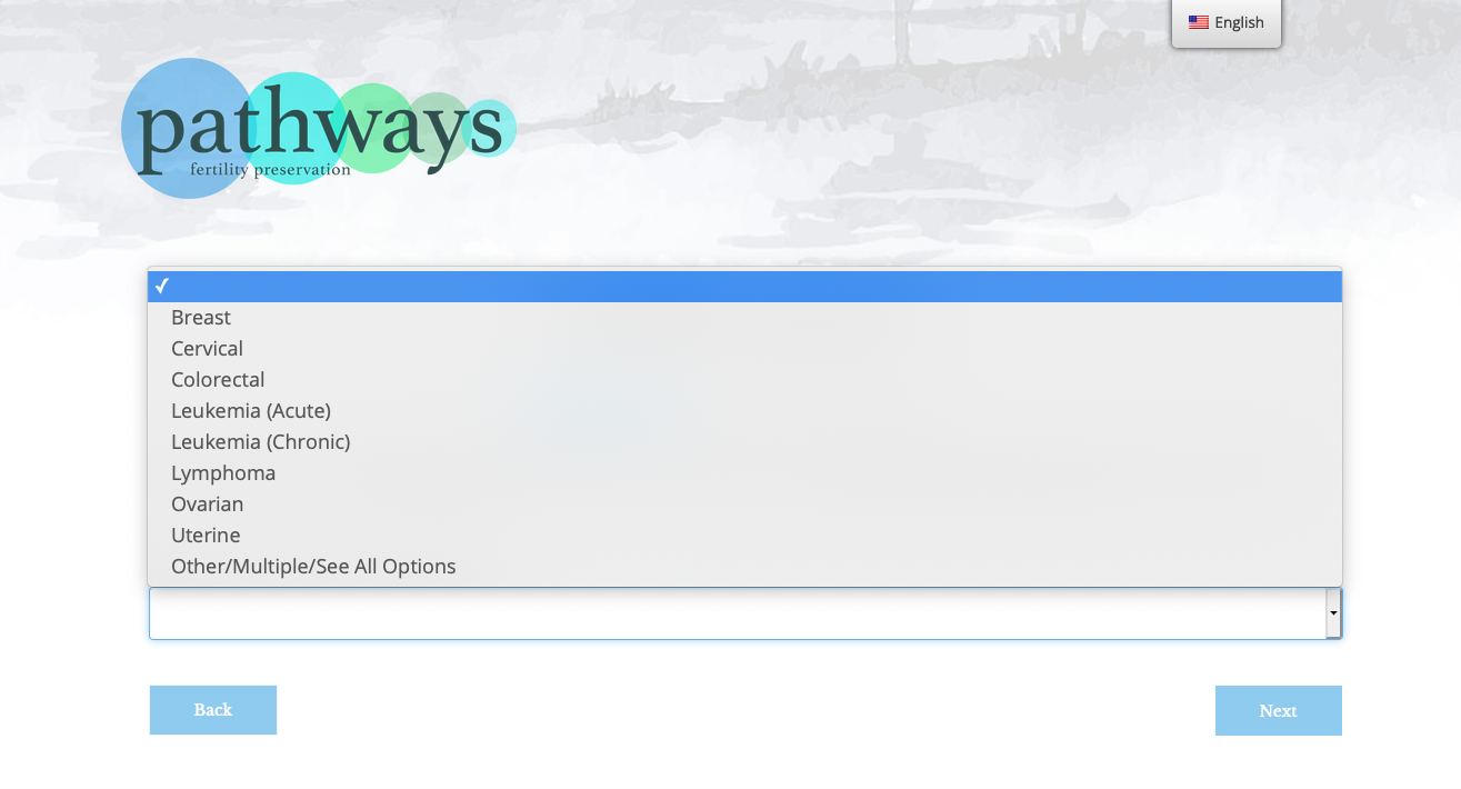
The interface needed to help a patient answer several different kinds of questions: What is fertility preservation? What choices are available? What have other people experienced? How do I make a decision?
That means hierarchy, labeling, and sequencing are part of the healthcare experience—not just presentation details.
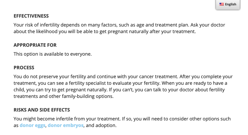
Healthcare UX often has to carry two things at once: emotional weight and factual precision. The visual system therefore stays restrained while the information itself remains explicit and structured.
The goal was not to decorate difficult material. It was to make it easier to enter, understand, and use.
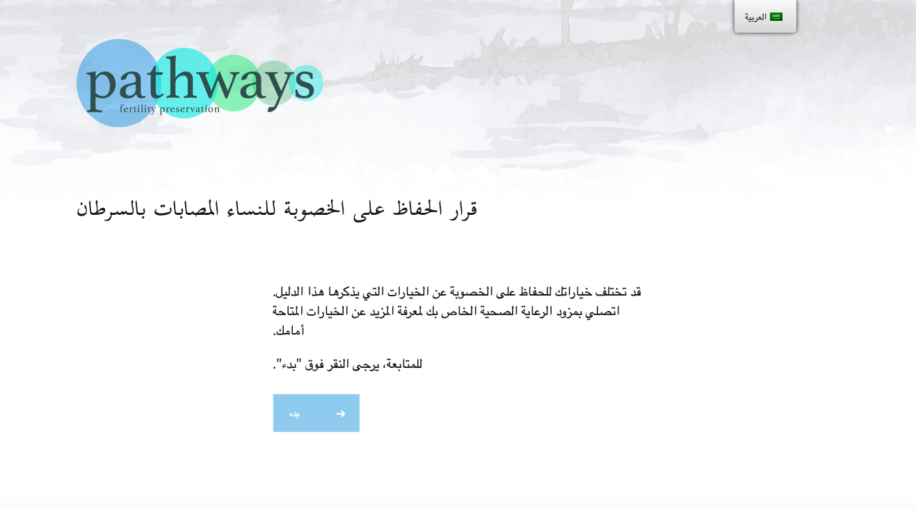
Pathways was coded to support three languages rather than treating translation as a separate deliverable. The Arabic experience also required the interface to accommodate right-to-left reading and layout behavior.
That made language support part of the product architecture: navigation, controls, content flow, and visual hierarchy all had to continue working when the language changed.
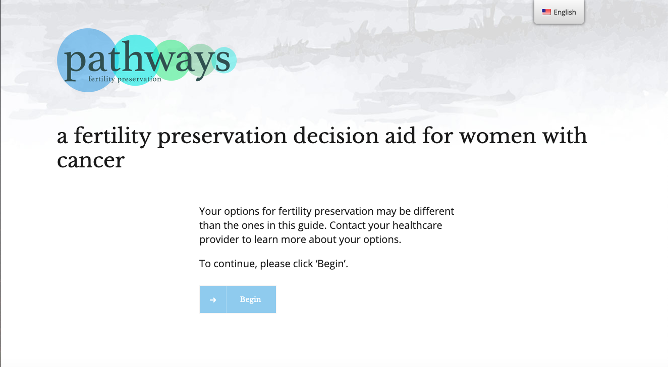
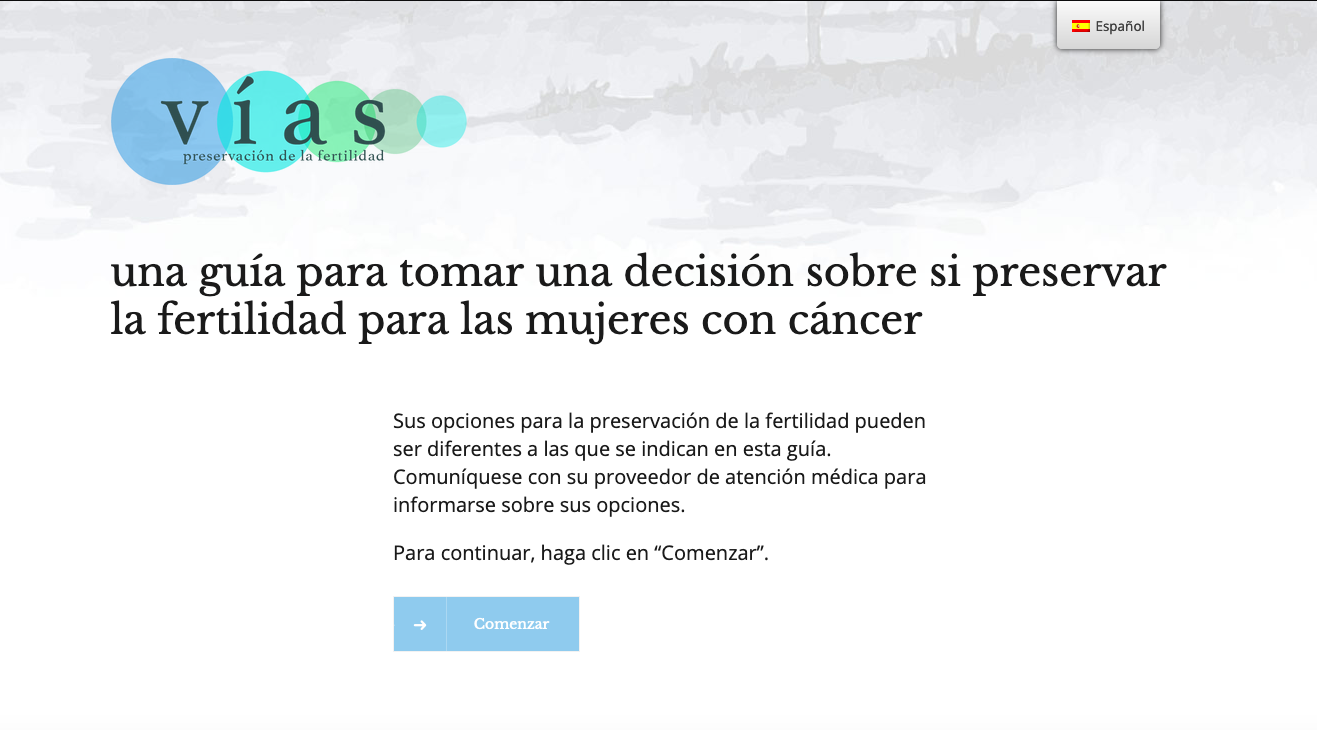
Interactive healthcare work recognized for the quality of the finished experience.
The value of the interface is measured by whether people can understand the material and act on it—not by visual novelty.